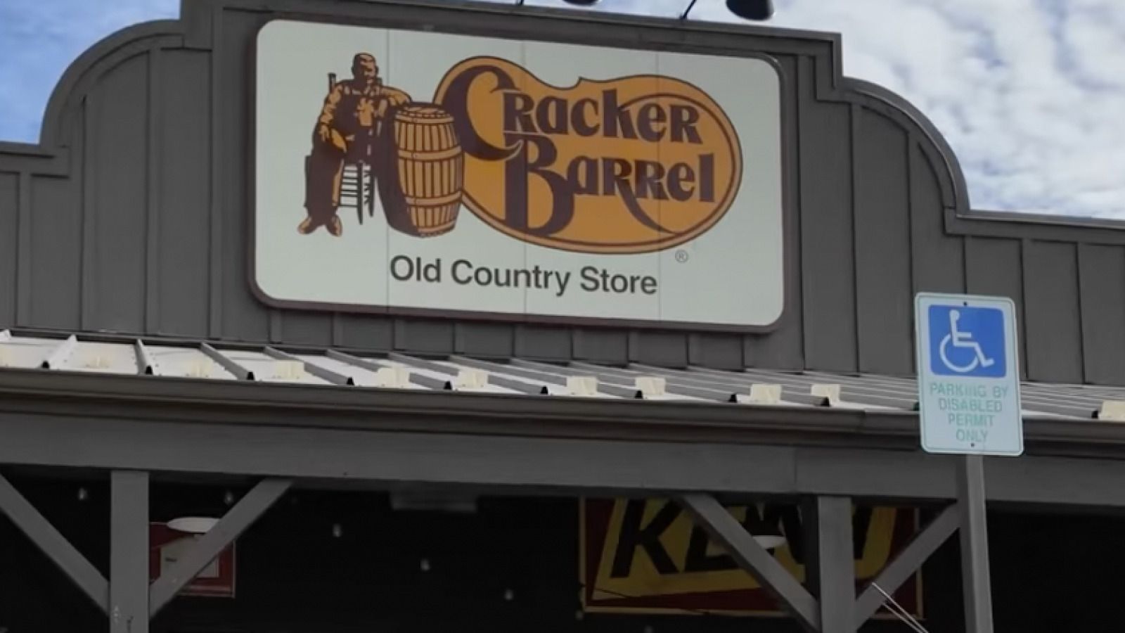
Shareholders are not happy with Cracker Barrel’s latest brand logo change.
Cracker Barrel’s stock dumped over 10% after the old country store/restaurant decided to change its brand logo.
The old brand logo featured a man leaning against a barrel with the phrase “old country store” underneath.
However, the new one got rid of both the man and the barrel and is noticeably bland.
Take a look:
I am boycotting @CrackerBarrel until they change the logo back and fire the CEO. pic.twitter.com/9VtEyup3aw
— Aaron 🇺🇸 (@TimberHandsFam) August 20, 2025
NBC News reported more in-depth on Cracker Barrel’s stock plummeting and the new branding at its restaurants:
Shares of Cracker Barrel Old Country Store plummeted roughly 10% on Thursday after the restaurant unveiled its new logo earlier this week as part of a larger brand refresh.
The new logo removes the image of a man leaning against a barrel that was prominently featured in the original, leaving behind just the words Cracker Barrel against a yellow background. The phrase “old country store” has also been removed.
The company said the colors in the logo were inspired by the chain’s scrambled eggs and biscuits.
The change is part of a “strategic transformation” to revitalize the brand that started back in May 2024. Under that mission, Cracker Barrel’s brand refresh includes updates to visual elements, restaurant spaces and food and retail offerings.
Cracker Barrel said in March that the refresh will still maintain the brand’s “rich history of country hospitality” and “authentic charm that has made the brand a beloved destination for generations of families.”
“We believe in the goodness of country hospitality, a spirit that has always defined us. Our story hasn’t changed. Our values haven’t changed,” Chief Marketing Officer Sarah Moore said in a media release.
JUST IN: Cracker Barrel stock nosedives over 14% after they unveiled their new bland logo.
The company decided to ditch its iconic logo as part of its new rebrand, prompting harsh backlash, but CEO Julie Felss Masino is convinced people love the changes.
The company is also… pic.twitter.com/V5eJDJhSJ9
— Collin Rugg (@CollinRugg) August 21, 2025
Users on X had a lot to say about the new change:
Why, Cracker Barrel, why? pic.twitter.com/3VcjhgPPNt
— Alex Bruesewitz 🇺🇸 (@alexbruesewitz) August 21, 2025
It’s not just the logo that changed, but the inside too:
Cracker Barrel CEO Julie Masino should face charges for this crime against humanity pic.twitter.com/auBFPi4bpr
— End Wokeness (@EndWokeness) August 21, 2025
Here’s the CEO:
LOL! "Honestly, the feedback has been overwhelmingly positive." – Cracker Barrel CEO.
Do they all lie?
pic.twitter.com/PPlFMH6mA4— Gunther Eagleman™ (@GuntherEagleman) August 21, 2025
Watch Michael Knowles break down the new changes:
In case you missed our original report:
Cracker Barrel Goes WOKE: Fans Call for CEO To RESIGN After Debut of New “Modern” Logo & Remodel
From country charm to corporate bland...
The Cracker Barrel you know and love is no more.
After nearly fifty years, their beloved, iconic logo has been replaced by a new, "improved" modern one.
Here it is:
Cracker Barrel has updated their logo for the first time in 47 years pic.twitter.com/H4pRyDz7Aa
— Dexerto (@Dexerto) August 20, 2025
Sleek. Modern. Soulless.
I can't help but wonder how much some graphic design "professional" was paid to just remove the man and his barrel and slap the text onto a bland mustard-colored blob-shape.
Heck, even this would have been a better redesign:
— Mrs B (@attackdogX) August 20, 2025
But, that's not even the worst part...
In addition, the restaurant/store is getting a new makeover.
And by that, I mean, just like with the logo, the soul of the place has been absolutely destroyed.
The once-charming interior reminiscent of old America is now white and devoid of any character.
See for yourself:
Cracker Barrel has RUINED their ENTIRE brand.
WTF is wrong with these people? pic.twitter.com/KJjEFwx7Lg
— Gunther Eagleman™ (@GuntherEagleman) August 20, 2025
It used to be a cozy place to eat and shop in a nostalgic atmosphere that was uniquely American.
Being there reminded you of the good old days.
Now, it just looks like a corporate nightmare.
Even the outside has been painted over in white...
Cracker Barrel didn’t just lose its logo. It lost its soul.
Under a CEO more obsessed with DEI quotas than country charm, they’ve:
– Scrubbed the iconic logo
– Remodeled 70+ stores into sterile showroom knockoffs
– Pledged $700 million to erase every trace of what made it feel… pic.twitter.com/iueJnO861v— Desiree (@DesireeAmerica4) August 21, 2025
Cracker Barrel didn’t just lose its logo. It lost its soul.
Under a CEO more obsessed with DEI quotas than country charm, they’ve:
– Scrubbed the iconic logo
– Remodeled 70+ stores into sterile showroom knockoffs
ADVERTISEMENT– Pledged $700 million to erase every trace of what made it feel like home
– And according to a civil rights complaint, they're openly discriminating against white employees
This isn’t modernization. It’s extermination of Americana, of warmth, of memory.
Congratulations, Cracker Barrel. You’re now Woke Barrel. Nobody asked for this.
It's all thanks to the new CEO Julie Masino, who is openly pushing a DEI regime at the company.
In fact, according to a civil rights complaint from America First Legal, Julie is discriminating against hiring white people.
Take a look:
Cracker Barrel’s new logo isn’t an accident — it’s CEO Julie Felss Masino’s project. She scrapped a beloved American aesthetic and replaced it with sterile, soulless branding.
Masino kept a DEI regime that promises to “identify, recruit, and advance” hires by race — and now… pic.twitter.com/6BLthLuQ1Y
— Woke War Room (@WokeWarRoom) August 20, 2025
Cracker Barrel’s new logo isn’t an accident — it’s CEO Julie Felss Masino’s project. She scrapped a beloved American aesthetic and replaced it with sterile, soulless branding.Masino kept a DEI regime that promises to “identify, recruit, and advance” hires by race — and now faces civil rights complaints from @America1stLegal to the EEOC and the Tennessee AG.She should resign and be replaced with leadership that will restore Cracker Barrel’s tradition.
Makes a lot of sense, doesn't it?
The person who made the original Cracker Barrell logo vs the person who removed it pic.twitter.com/L8PbuA2sn5
— Jack Poso 🇺🇸 (@JackPosobiec) August 20, 2025
But hey, no worries...
Julie says all the feedback on her woke Cracker Barrel rebrand has been "overwhelmingly positive!"
Watch this:
GO WOKE, GO BROKE: New DEI-hire CEO is rebranding Crackle Barrel to decolonize it. Her first move was to remove the old-fashioned country gentleman meant to evoke nostalgia and Americana. pic.twitter.com/8y5A68COYO
— @amuse (@amuse) August 20, 2025
You're right, Julie, we all hate love it!
Here's some of that "overwhelmingly positive" feedback:
Yes let’s remove everything charming and distinct from the logo and make it as generic and boring as we possibly can https://t.co/3K91KLH0sb
— Matt Walsh (@MattWalshBlog) August 20, 2025
They removed the cracker and the barrel 🙁
— Riley Gaines (@Riley_Gaines_) August 21, 2025
People love Julie's new design so much that they are calling for her resignation -- or worse!
I don’t want to sound melodramatic, but she needs to be thrown into a volcano. https://t.co/UtD8jIMLx1
— Sean Davis (@seanmdav) August 20, 2025
Liberal white women ruin everything they touch. https://t.co/nLdHkbe0RK
— Sadie (@Sadie_NC) August 20, 2025
Cracker Barrel CEO Julie Masino should face charges for this crime against humanity pic.twitter.com/auBFPi4bpr
— End Wokeness (@EndWokeness) August 21, 2025
Even Don Jr. chimed in on this travesty:
WTF is wrong with @CrackerBarrel??! https://t.co/LkYB5N34Qi
— Donald Trump Jr. (@DonaldJTrumpJr) August 20, 2025
For the Win via Yahoo News shared even more "positive" feedback for Julie:
Rather than keep the rustic charm of a dusty old Southern kitchen where the smell of country ham and stovetop biscuits coats the air, walls adorned with busted farming equipment and Rockwellian photos from a bygone American era, the new remodels look like joyless First Watch knockoffs.
We get changing with the times, but this is the Cracker Barrel for crying out loud. You want to improve the Cracker Barrel? Up the game on the food options; don't take away the one thing that made it worthy of nostalgia, its aura.
You go to the Cracker Barrel with your grandparents early on a Tuesday morning in the summer before going to Costco. You play checkers with your brother by the fireplace on a cold winter night while your family waits for the meal. You sit in the rocking chairs on the porch during a confusingly long wait for Saturday brunch. You run over to that mechanical toy parrot who records what you say and repeats it in the gift shop and tell it a potty word for some poor sap to hear once you scurry away, giggling like an idiot.
That's the Cracker Barrel, folks. That's America.
The rebranded logo cements what a travesty this is to undo the foundation a proud chain restaurant tradition. No longer is it an "Old Country Store." No longer is there a friendly man reclining in a wooden chair.
No longer is there even a barrel. It's the Cracker Barrel! Where's the barrel?!
Now, it's just a big yellow blob designed by a first-year graphic design student studying minimalism.
That stinks. I'm sorry, but it stinks. Why did we have to change the Cracker Barrel logo? The "sunny" designs chase the poppy casual brunch vibes of Maple Street Biscuit Company and Another Broken Egg Cafe. Those are a dime a dozen; they're not the Cracker Barrel. What's next? A hip, modern spin on the Waffle House?!
ADVERTISEMENTThat's not what Cracker Barrel is! Cracker Barrel is supposed to feel like yesterday, like a wooden time capsule back to a time where your mom would complain to the waiter that your table is way too close to the smoking section and bacon was considered a side dish to go with a huge stack of pancakes, made-to-order eggs and cinnamon apples. It's the place where you and your grandma go get a quick bite to eat before going to the movies, or the place where a 10-top table is needed because your entire family decided to show up for an impromptu supper one random night.
I couldn't agree more with all of this...
It looks like Cracker Barrel has chosen the Bud Light path....totally alienating its customer base.
What are your thoughts?
Will you go to Crack Barrel anymore after its sterile, woke rebrand?

Join the conversation!
Please share your thoughts about this article below. We value your opinions, and would love to see you add to the discussion!